Why Your Brand Colors Matter
Completing the Aesthetic with Colors
We recently sat in on a workshop where the speaker told a specific group that their branding didn’t matter.
Of course C’s face was in “WUT” mode. They went on to explain that none of the business owners would reach Starbucks or Target level branding.
But what the speaker failed to realize is that branding is a strategy, and Starbucks and Target did not become what they are as companies without being intentional about their branding. How often do brands begin as globally recognized icons? Impactful branding, beginning with selecting your brand’s colors, with your products, and what you want to evoke in your customers in mind, is crucial to achieve your goals.
For most of these business owners, the intent is to be top of mind in their respective city or state. Is it possible to also root your goals with the long-term idea to grow to a Starbucks or Target branded company? Of course, but if anything that makes it even more important to be strategic with your branding.
So, when it comes to branding, know that it DOES matter. And, a major part of your visual brand identity is your colors.
Colors, logos, and fonts all fall in line with your brand strategy and identity. When it comes to colors, you want to use shades that express the main emotions your product is bringing into your customers’ lives.
We have a NEW free worksheet that will help you learn what emotions are associated with specific colors, while also giving you room to explore your palette options.
Why Colors Matter
Colors matter because they convey the ~vibes~ when creating your marketing essentials.
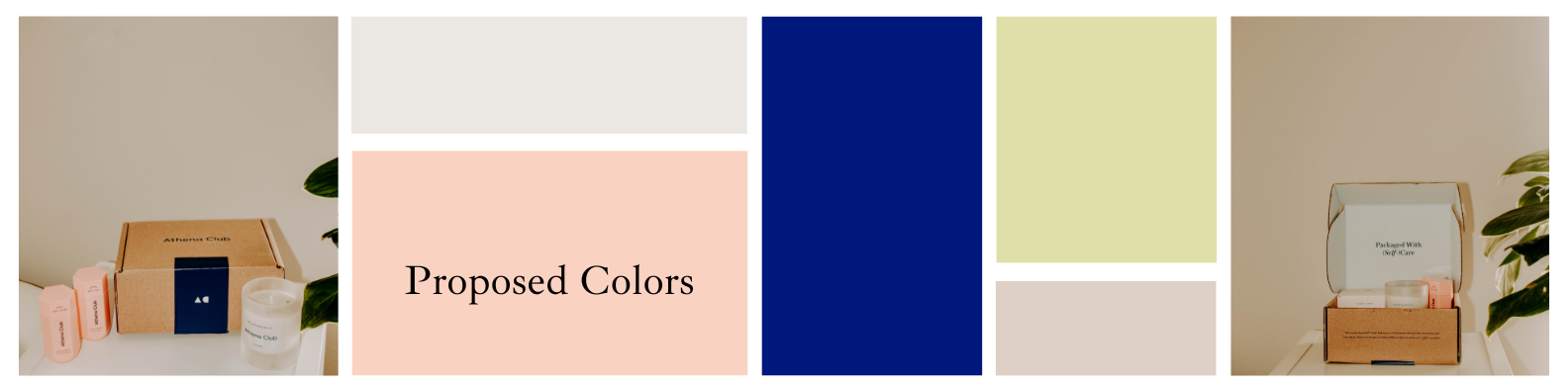
Using Athena Club as a case study, let’s really take a look at the products this brand offers and their goal.
Note: Athena Club is NOT our client. We’re just using their brand as a case study, beginning with how we would go about dreaming up the ideal impactful color palette for this brand.
As a lifestyle and wellness product based company, we leaned into the idea that slightly muted colors would really push the “bathroom essentials” vibe for this company.
Blue being the main color to inspire calm and integrity is a prime option, as this brand is looking to make waves in this industry to be top of mind when it comes to skincare and setting that “self care” mood.
The secondary color, a pinkish peach, is a happy medium between red’s Love and orange’s Warmth. In effect, this color serves as a beautiful companion to the blue and enforces the idea that self care is easy with this brand.
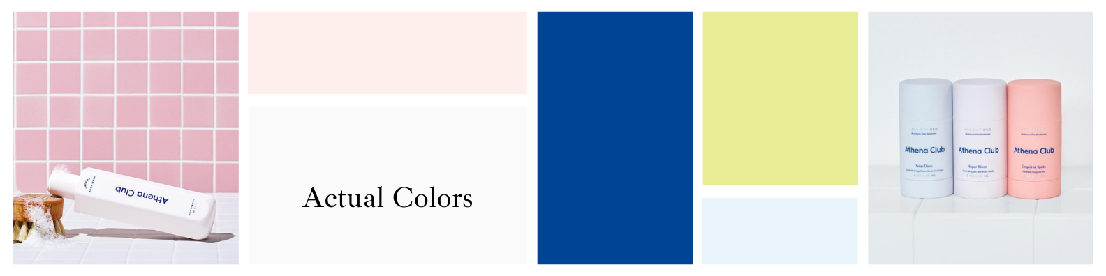
Now, when we look below at the brand’s ACTUAL colors we can see that we’re not far off in the idea. In fact, Athena Club’s actual colors are more vibrant and even give a retro feel, signifying that we’re having FUN keeping up with our self care.
Don’t let speakers that don’t understand what branding IS and what it DOES FOR YOU tell you that it doesn’t matter.
Just because you’re not Starbucks or Target doesn’t mean your brand can’t be top of mind for your ideal customer.
You want to be recognized in YOUR MARKET.
Getting specific about who you want to reach and how your product enhances their lifestyle is SO important to curating a palette to get that message across.
If you’re ready to tackle your branding, schedule a discovery call with us!
We can’t tell you how eager we are to help you build a brand that your customers will return to shop with time and time again!