Cloud 9 Candles
A Brief Project from The Brief Collective: Luna Tyler was looking for a pastel brand. While we couldn’t replicate the geometric shape of her candles for this mock project, we took to heart the fun and girlhood moment she was creating with her candle company. The goal with any brand, especially a candle company, is to create a vibe and setting the ideal customer can envision for themselves. Below you’ll see what we proposed for this mock project.
What We Delivered
BRAND DESIGN
A custom logo and font that echo the shape attraction Luna was looking for.
In the candle company industry, standing out as a brand comes after the scent and how appealing the candle looks for a home.
It was important to us that the logo was flexible for an icon that the company could use to simplify looks and emphasize creativity through the actual candle.
PRODUCT PHOTOGRAPHY
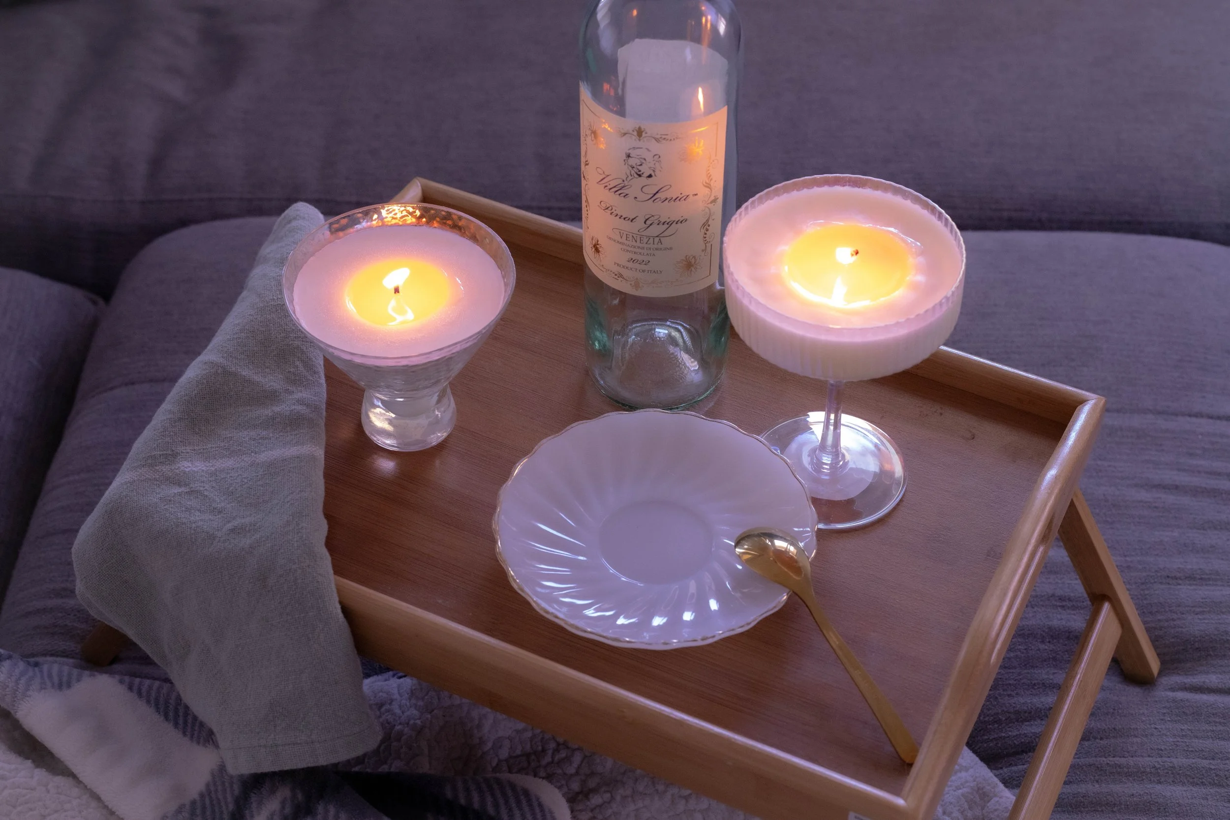
Luna received website product images as well as brand marketing images that she could immediately build her socials and email marketing off of.
Like most small businesses, Luna will take her starter gallery and build sustainable documents like lookbooks for wholesale, ad graphics, and even custom cards to insert into her order packaging.
LABEL DESIGN
The one item people have a love/hate relationship with in stores. A poorly designed or not functional label can make people move to another brand. With this in mind, we celebrated the girls’ night vibe by centering the design a tag or bottom of glass approach that wouldn’t interfere with the candle itself. See for yourself. Would you light this baby up in your living room for a wine and pizza night with your girls?
Here’s A Preview
Below is a glimpse into the Pinterest board inspiration we put together to capture all the funky fun that this brand needed to embody.
Brand Logo & Icon
This logo and icon duo!!!!
This set was SO FUN to work on. Yes, the icon is not perfectly centered. Yes, the 9 has a lil' cloud. Yes, we replaced the O and A in the name with a cloud and flame.
SO MUCH FUN! We loved taking on this mock project and brainstorming all the ideas behind the brand’s look and strategy. Honestly, we hope a candle company out there feels inspired by this brand and seeks to create their own unique line of candles with an iridescent funky twist.
Brand Colors
Typically, Raine & Rose works with 5 brand colors, as we utilize Squarespace for website design and the platform allows you 5 color options for a branded approach.
Most designers try to stick this format as well, at the end of the day a brand really needs a solid guide, yes, even for colors. When designing for Cloud 9 Candles, we knew there would actually be 2 main brand colors, the rest were highlights of the iridescent look and to be used sparingly. In this case, we would recommend using the in-between colors for buttons and the header font on the website or on graphics/print media.
Brand Color names are not necessary to write out and title, but it helps the client understand the inspiration and application of the colors they are utilizing for their brand. (It also helps to organize their logo files!)
The why
In order for Raine & Rose to move forward with the initial design concept, we have to consider the WHY.
Why does this brand exist outside of financial gain?
Why does this brand matter for its location and industry?
Why does the founder want to share this specific brand?
When it came to Cloud 9 Candles we knew this funky and color-filled brand would be such a great fit for our design style.
Brand Photography
Cloud 9 Candles brand photography curated and captured by Theresa.


Label Design
A tag and label design will keep things simple and classy for all the girl’s nights that women shopping the candle line. Each option has separate benefits for sharing the brand and product information.


