Mija’s Manera
Project Included: Website Design & Brand Starter Kit
A celebration of Mexican culture and a step into CBD lifestyle, Mija’s Manera is a fusion of modern taste grounded in Puebla’s artistic history.
The Inspiration Deep Dive
Below is a glimpse into the Pinterest board inspiration we sent to Christina to get a feel for the direction she wanted to take her branding.
Sometimes clients already have a Pinterest board or website references ready to go, and we take bits and parts of their own inspiration along with pieces we find while researching their industry, their aesthetic, and more.
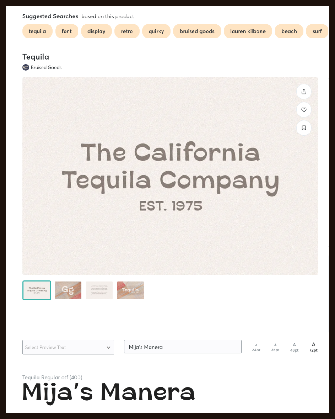
We also had to determine what direction to go for the font choices that would play a role in the logo, so we sent over this preview of the brand name in different fonts we felt would match the ~vibe~.
It’s not necessary that brands choose a custom font, but when it came to the initial design inspiration it was evident that Mija’s Manera would require a flair in its typography for the main header font. (We went with Mistica for the brand.)
Brand Logo & Icon
The customized Mistica font and an icon echoing Puebla art and CBD plant, this logo and icon made for a perfect visual to represent Mija’s Manera online and offline.
Color variations for the logo were provided to ensure flexibility across print and social graphics. This is a norm for Raine & Rose, we know the feeling of trying to make your logo work on top of lighter, darker, or patterned backgrounds. A flexible logo selection gives you freedom to continue creating what you have in mind.
Brand Colors
Typically, Raine & Rose works with 5 brand colors, as we utilize Squarespace for website design and the platform allows you 5 color options for a branded approach.
Most designers try to stick this format as well, at the end of the day a brand really needs a solid guide, yes, even for colors. When designing for Mija’s Manera, it became apparent that we would need to use 6 colors. This decision was not made lightly, in fact, it was almost necessary to ensure we were capturing the cultural representation part of the brand’s visuals.
Brand Color names are not necessary to write out and title, but it helps the client understand the inspiration and application of the colors they are utilizing for their brand. (It also helps to organize their logo files!)
The why
In order for Raine & Rose to move forward with the initial design concept, we have to consider the WHY.
Why does this brand exist outside of financial gain?
Why does this brand matter for its location and industry?
Why does the founder want to share this specific brand?
When it came to Mija’s Manera the why was sharing a fusion of Modern Mexican taste with a love for the CBD lifestyle.
And that’s when we started the design process. The image to the right shows the initial concept ideas we were playing with when considering the artistic style of Mija’s Manera.
As you can see, initial concepts don’t always translate to the end product, but they get us on the right track!
The website plan
Our plan included 5 customized webpages to meet the small business needs with flexibility for in-person events.
While Raine & Rose usually works with Squarespace for websites, we did have to hop over to Shopify for this custom site, as the payment processor had no connection available for Squarespace in an easy and effortless way. The key decision here was made to ensure the owner of Mija’s Manera could find all of her assets in one place, so moving over the domain, site content, and order processing to Shopify made the most sense.
Since this brand did not include full branding, we headed over to Canva to find temporary placement graphics to share more of the brand’s story on the home page, as seen in the photo here.
Creating an in-depth store policy was essential to protecting this business, each product is truly unique and disclosing certain design elements was important to ensure customers understand that not each product will look exactly like the product image on the storefront.
Raine & Rose shared in this value as transparency can be a transformational value to build trust, reliability, and recognition with your customers. On the flip side, protecting your business by being transparent in your policies and communications ensures that you cover your bases for your brand integrity and accountability.
The store
So, the store was important - we not only had to work with an attorney but flex our copywriting skills to ensure each product description was approached correctly as we couldn’t just say here’s a b0ng. (Yes, we’re filtering ourselves.)
The store will continue to be a work in progress for this brand, as they develop stories or historical relevance for each design and implement that onto each individual product page to give customers a tailored experience for the vases they are interested in.
Another important part of this shop page was making sure the imagery was cohesive. We typically recommend following a brand photography guide or having our in-house Creative Director, Theresa, take care of the photographs for you.
The brand and founder
Since this business was barely launching, there wasn’t too much history for the owner to tap into for the brand story.
We made the decision to dive into the culture aspects of CBD and Mexican history, specifically art in Puebla, Mexico. It’s important to note here that the client was really depending on ChatGPT to give her more context and copy to work with in sharing her brand on the web. While we aren’t against using a tool like ChatGPT, we do firmly believe that your final version of copy should sound like you/your brand and focus on your personal goals and not generalized goals or ideas.
This was the perfect moment for us to tailor her vision into a story that was rooted in her dream and mission. With so much lifestyle infused into the products and the target customer, this specific about page for Mija’s Manera gives customers a true look into the why behind this brand’s existence.


